Aleš Sýkora / November 28, 2023 / 6 comments
Oxygen Lazy Load Gallery (Working 2023)
3 min read / Oxygen Builder, Plugins, WordPress / Share on: Twitter, LinkedIn, Facebook
Post summary: Tutorial for working Lazy Load solution for Oxygen Builder gallery module.
If you try to figure out why your Oxygen Gallery is not lazy loading like you expect, try this tutorial. Hope it helps you! In my tutorial will be masonry gallery rebuild to 1:1 square gallery. Are you looking for masonry gallery? The main thing is changing the rule of loading images and never use Flex gallery.
Many thanks to Alexander Buzmakov from Official Oxygen User Group on facebook who comes with this idea.
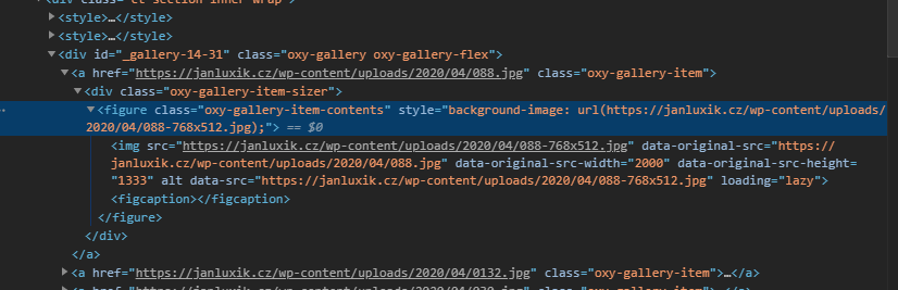
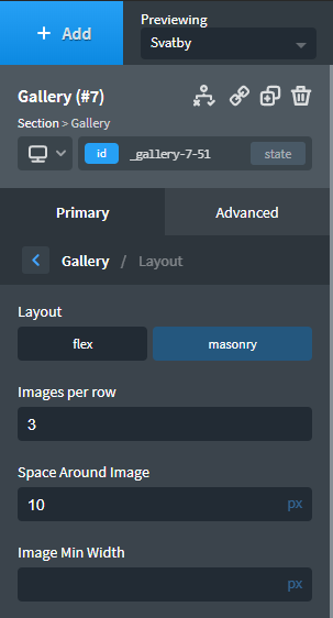
Gallery type Masonry vs. Flexbox
Always use Masonry Gallery. If you use the Flex gallery, Oxygen starts to generate images from the gallery as a background for < figure > elements.
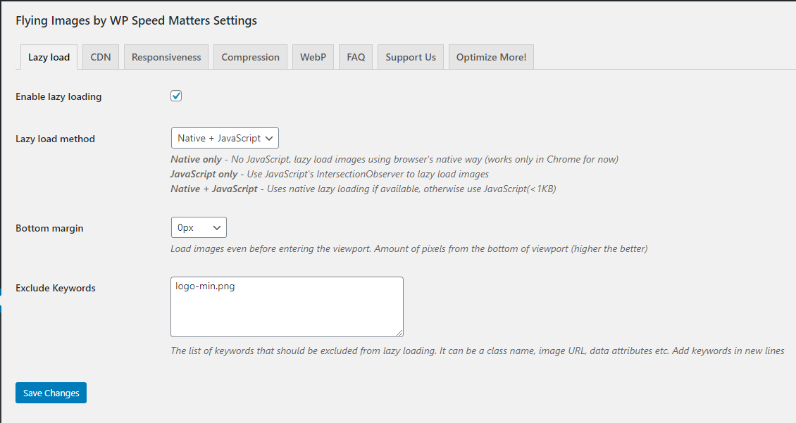
Lazyload plugin which plays well with Oxygen
I tried lot of lazyload solutions – WP Rocket, A3 Lazy Load, Autoptimize lazy load, jQuery.Lazy and others. Best working for me is Flying Images by WP Speed Matters and WP Rocket.
I am not using the CDN, so I uncheck everything on other Tabs and just set up this Lazyload settings. I am using Native + JavaScript method. It means if browser have native support for lazyload (from Chrome 76), it will add
loading="lazy"attribute. If browser do not support it, then javascript is being used. I also dont want to lazyload website logo, so I exclude it.
Changing the way Oxygen masonry gallery loads
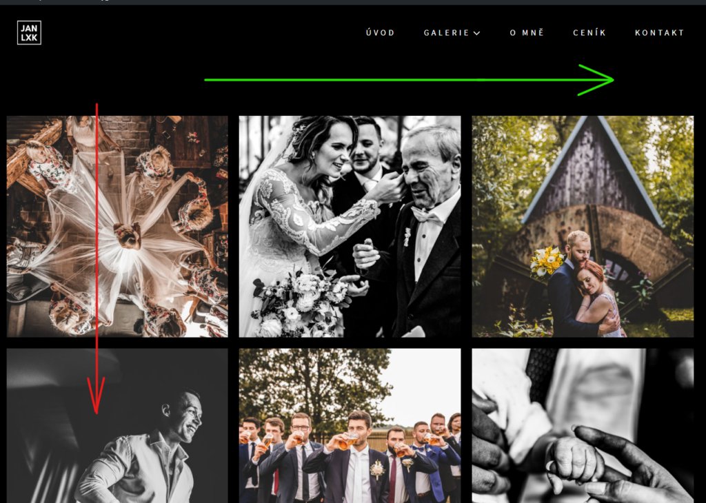
When you refresh the page now, you will see, that masonry gallery loads column by column. So the lazy load do nothing here, because all images are being loaded automatically. So we need to load the gallery same as flex columns in flex row.
The CSS
You can play with the CSS to make your own layout. But you will need this definitely for Main gallery container.
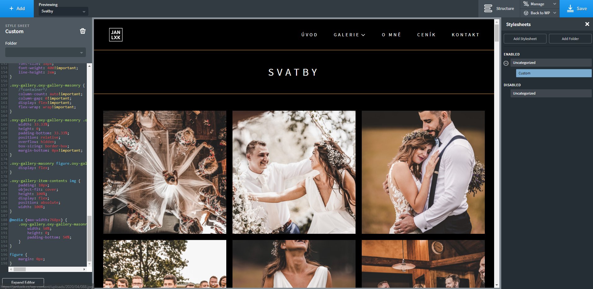
.oxy-gallery.oxy-gallery-masonry {
    column-count: auto!important;
    column-gap: 0!important;
    display: flex!important;
    flex-wrap: wrap!important;
}
Gallery item
if you want to make a square images, you need to set up little flexbox hack. Set the width in percentage to set the columns and set the padding-bottom to same percentage. It will make a square layout.
.oxy-gallery.oxy-gallery-masonry .oxy-gallery-item {
    width: 33.33%; /*same*/
    height: 0;
    padding-bottom: 33.33%; /*same*/
    position: relative;
    overflow: hidden;
    box-sizing: border-box;
    margin-bottom:0px!important;
}
<Figure>
.oxy-gallery-masonry figure.oxy-gallery-item-contents {
    display: flex;
}
Image
.oxy-gallery-item-contents img {
    padding: 10px;
    object-fit: cover;
    height: 100%;
    display: flex;
    position: absolute;
    width: 100%;
}
Responsivity
If you want to change the number of columns on mobile or other device, use the @media queries. I set mine to display two columns on mobile.
@media (max-width:768px) {
    .oxy-gallery.oxy-gallery-masonry .oxy-gallery-item {
        width: 50%; /*same*/
        height: 0;
        padding-bottom: 50%; /*same*/
    }
}
You need to put this in your Custom stylesheet and voilá, it works :-).
Complete CSS Code
.oxy-gallery.oxy-gallery-masonry {
    column-count: auto!important;
    column-gap: 0!important;
    display: flex!important;
    flex-wrap: wrap!important;
}
.oxy-gallery.oxy-gallery-masonry .oxy-gallery-item {
    width: 33.33%; /*same*/
    height: 0;
    padding-bottom: 33.33%; /*same*/
    position: relative;
    overflow: hidden;
    box-sizing: border-box;
    margin-bottom:0px!important;
}
.oxy-gallery-masonry figure.oxy-gallery-item-contents {
    display: flex;
}
.oxy-gallery-item-contents img {
    padding: 10px;
    object-fit: cover;
    height: 100%;
    display: flex;
    position: absolute;
    width: 100%;
}
@media (max-width:768px) {
    .oxy-gallery.oxy-gallery-masonry .oxy-gallery-item {
        width: 50%; /*same*/
        height: 0;
        padding-bottom: 50%; /*same*/
    }
}
Test if oxygen gallery lazy load works in browser
- Open chrome developer tools and go to the network tab.
- Refresh your page and wait until it loads.
- Scroll down and look how it loads new resources with lazyload.
Fuel my passion for writing with a beer🍺
Your support not only makes me drunk but also greatly motivates me to continue creating content that helps. Cheers to more discoveries and shared success. 🍻

Alex Gdn
Hi Ales,
thank you very much for your great tutorial!
I was wondering what to modify in the css if I wanted to keep the original images ratio because my gallery uses landscapes and portrait oriented pictures.
Thank you in advance!!
Alex.
Alex Gdn
Hi Ales,
I just checked it out.
Thank you so much amazing work!
I can’t wait to try it and will recommend your website to people looking to do the same.
Best regards,
Alex.
Aleš Sýkora
Hey Alex! Check my new article about creating a masonry gallery!
Aleš Sýkora
Hi Alex, I understand. I am not sure if you can create masonry layout which loads in rows… I don’t think so.. But let me know if you find something! Or give me clue and I will try to create it ;)
Meanwhile, take a look at prepared:
.container {

  display: grid;

  grid-template-rows: masonry;

}
Alex
Hi Ales,
thank you for your reply! I tried but it doesn’t work.
In fact what i’m after is to display a gallery from ACF in a masonry style, with portraits and landscapes but ordered in rows and not columns as it is made by default…
I’ll keep looking for a way to do it. ;)
Best regards, Alex.
Aleš Sýkora
Hello Alex! So I think you can just use the Masonry Gallery and use only the first lines of CSS code which changes the way of loading images. I did not tested, so try it and let me know! Best regards, Aleš
.oxy-gallery.oxy-gallery-masonry {column-count: auto!important;
column-gap: 0!important;
display: flex!important;
flex-wrap: wrap!important;
}